
主题
useScreenSafeArea
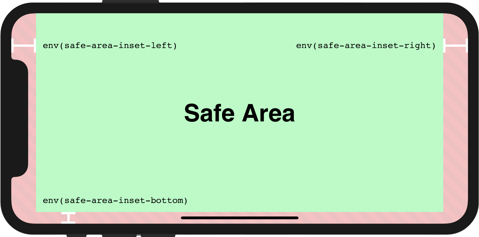
反应性 env(safe-area-inset-*)
🌐 Reactive env(safe-area-inset-*)
示例
用法
🌐 Usage
为了让页面在屏幕上完全渲染,必须首先在 viewport 元标签中设置额外属性 viewport-fit=cover,viewport 元标签可能如下所示:
🌐 In order to make the page to be fully rendered in the screen, the additional attribute viewport-fit=cover within viewport meta tag must be set firstly, the viewport meta tag may look like this:
html
<meta name="viewport" content="initial-scale=1, viewport-fit=cover" />然后我们可以像下面这样在组件中使用 useScreenSafeArea:
🌐 Then we could use useScreenSafeArea in the component as shown below:
ts
import { useScreenSafeArea } from '@vueuse/core'

const {
  top,
  right,
  bottom,
  left,
} = useScreenSafeArea()如需更多详细信息,你可以参考此文档:为 iPhone X 设计网站
🌐 For further details, you may refer to this documentation: Designing Websites for iPhone X
组件用法
🌐 Component Usage
vue
<template>
  <UseScreenSafeArea top right bottom left>
    content
  </UseScreenSafeArea>
</template>